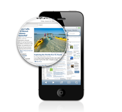
 Looking at my iPhone 4 screen makes me wish all my screens had such high DPI. Everything looks so crisp. During the development of GoodDay I realized that the icons and images I’d used in my own app were not being rendered in high resolution. I wanted to share how I addressed that and how you could address it with your own mobile web site/theme/app as well. Basically the solution is to use divs and set specific sized background images for the high-DPI displays.
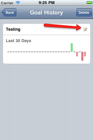
Lets look at the edit icon for example:
Since this is a PhoneGap app it’s rendered in Webkit. Webkit treats all screens as if they were normal DPI. So 1px on an iPhone 4 is actually 2 retina display pixels. On the page I used the following HTML:
<div id=”goalEditButton”></div> <!– To represent the edit icon. –>
Then in the CSS I do the following:
#goalEditButton
{
height: 16px;
width: 16px;
background: url(./themes/apple/img/edit.png) no-repeat; // This is actually a 32×32 image
-webkit-background-size: 16px 16px;
}
The 32×32 image is used so the pixel resolution is doubled when it’s forced down to 16×16. Of course if you want to save some load time for lower DPI screens then you’ll need to have a CSS file specifically for each case and switch between them ala:
_<link rel=”stylesheet” media=”only screen and (-webkit-min-device-pixel-ratio: 2)”
type=”text/css” href=”retina.css” />_
If you want more information and even slicker techniques (leverage jquery to switch images automatically) then I recomend reading the following articles:
http://blog.iwalt.com/2010/06/targeting-the-iphone-4-retina-display-with-css3-media-queries.html
